
Time-comparative analysis is a laborious exercise in Facebook’s Ads Manager interface, but has gotten more flexible over the last few months. Here are three options for performing a time-comparative analysis in Facebook.
But First, Why Should I Perform This Type Of Analysis?
A time-comparative analysis can help you answer questions such as:
- How Long Should I Run A Campaign Before It Loses Steam?
- How Should I Allocate My Budget Throughout The Timeline Of A Campaign?
- When Do I Get The Most Conversions At The Lowest Cost?
Method One: Use The Compare feature
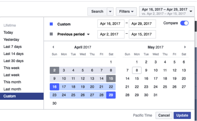
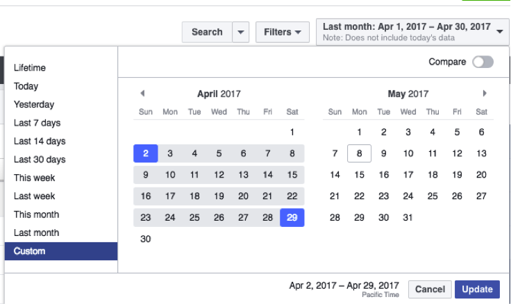
This feature is relatively new (to Facebook, let’s leave Google out of this), and was much needed in Ads Manager. Simply turn on “Compare” when selecting your date range and it will automatically select the Previous Period. You can also choose Previous Month, Previous Year, or Custom.
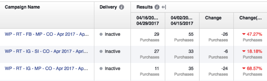
Once you have your time ranges set up, little arrow icons will appear next to your metric headers. Click on an arrow and new columns will appear that show results from both time ranges, numerical change and percent change, like so:
This is the simplest and fastest way to compare two time frames – but the operative word there is two. If you want to analyze three or more time frames, such as the weekly results of a four-week campaign, you’re out of luck with this feature (but scroll down to method three for a workaround)!
Method Two: Use Performance Charts
Note: Facebook has been deploying this feature as part of its April 2017 Ads Manager update. It may not appear in all accounts at the time of this article.
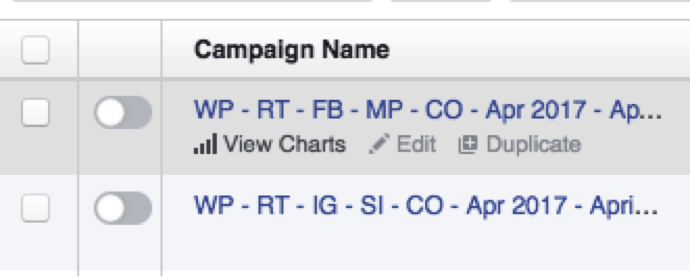
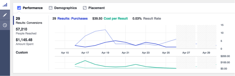
If you hover over any one campaign, ad set, or ad, you will see an option appear that says “View Charts.”
Clicking “View Charts” will open up a graph that shows Results and Cost-per-Result over time. You can scroll through the graph to see daily results, or move your mouse off the graph to see aggregate results.
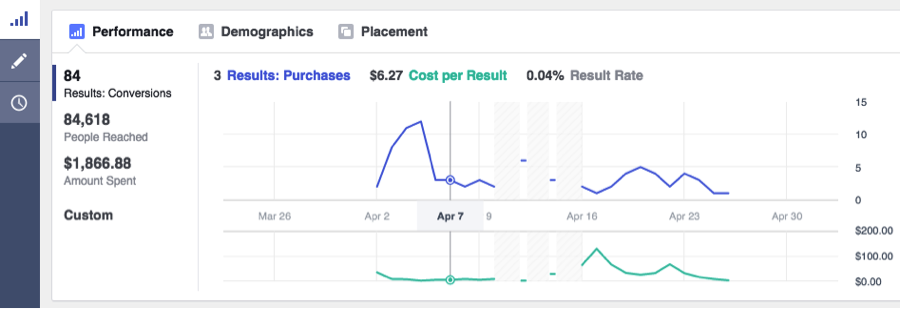
I like the visual element that this method allows, but it’s hard to identify patterns when you have to click in and out of your campaigns, ad sets, or ads.
Luckily, you can combine the first two methods into one mega chart:
This is more useful, but only if you’re comparing two time frames within the same campaign, ad set, or ad. What if you want to see how several campaigns performed week-over-week? The next method facilitates this.
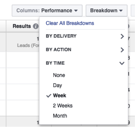
Method Three: Use Breakdowns
This method requires the most steps, but can also yield the most useful results – especially if you’re analyzing several campaigns at once.
Here are the steps:
Open your business’s Ads Manager. In the top right corner, set the total length of time you want to analyze. In this example, I’m going to break down one month’s worth of data into 4 weeks.
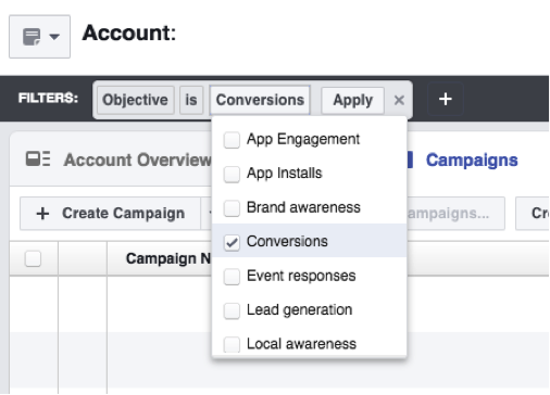
Use the Search dropdown to find campaigns that you want to aggregate. For example, if you want to look at all of your campaigns optimized for conversions, you can apply the filter “Objective is Conversions” like so:
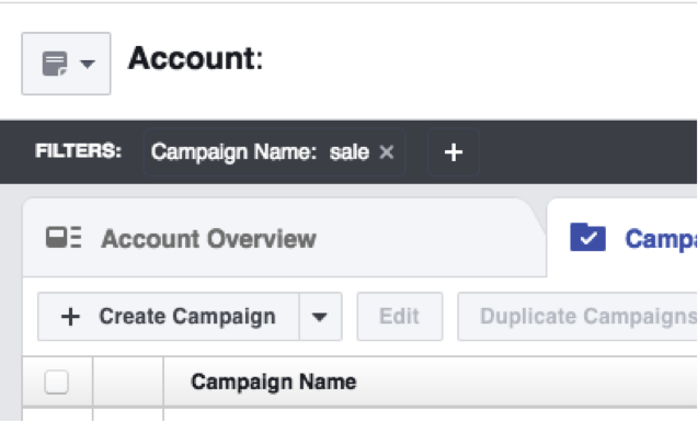
You could also find all the campaigns that relate to a particular promo by applying the filter “Campaign Name contains ____.”
Select your comparative time ranges from the Breakdown dropdown. Note: this type of time-comparative breakdown can be done by day, week, 2 weeks, or month. In this example, I’m going to use a week breakdown.
You will end up with a view like this:
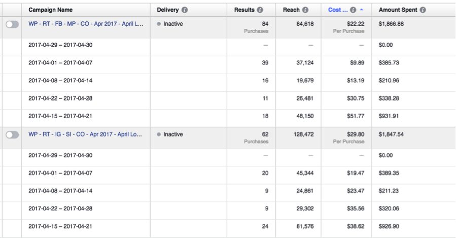
You’ll now be able to scroll through all your campaigns that fit your search criteria and make some quick assessments.
Example Analysis Based On Week-Over-Week Breakdown
In the screenshot above, I’ve sorted the data by “Cost-per-Result.” There are two campaigns that each spent about $1,850. They follow the same performance pattern week-over-week:
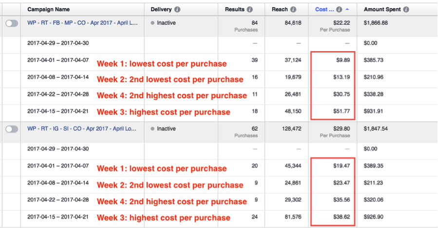
In both campaigns, costs are lowest in Week 1. This makes sense, as Week 1 allowed Facebook to gauge ad relevance, optimize delivery, and target the lowest hanging fruit. In Week 2, we decrease spend by way of pausing the poorest performing ad sets within each campaign. We see volume drop off as well, but costs have been effectively managed.
In Week 3, we ramp up spend on the remaining top performing ad sets within each campaign to try and regain volume. These purchases come in at the highest price of any week, but for this account we’re still well within our cost-per-purchase threshold.
In Week 4, spend comes full circle – but look at the dramatic difference in cost-per-purchase and volume. Based on this analysis, it would be useful to try shifting most of the budget to the first week, or running the campaigns for two weeks instead of four.
Special Note On How Facebook Uses Your Money
Decreased spend forces Facebook to exercise more discretion when delivering ads, which can cause costs to drop. But the trade-off is volume. And, if you try to exercise this tactic before a campaign has run long enough to optimize, you could end up with a total drop-off in results.
Here’s an analogy:
If you’re in a bar, “on the prowl” as they say, you’re better off having your best friend be a wingman than someone you’ve never met. Facebook is your wingman, and it’s trying to find you the best “date” in the form of a customer. But the less Facebook knows about you and the type of person you’re trying to court, the more difficulty it has being your wingman. Become friends with Facebook before you ask it to be your wingman.