
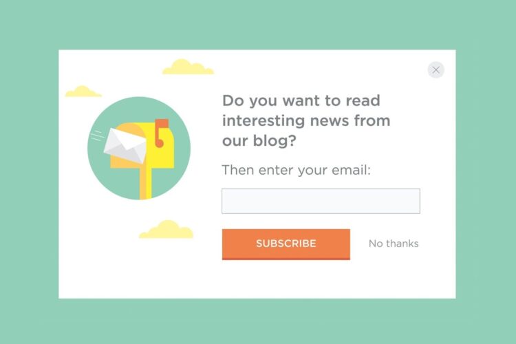
Lightboxes. Pop-ups. Modals. Email capture. Opt-in boxes. No matter what you call it, asking for email via a pop-up window is a widely used practice that often spurs debate among marketers.
Whenever I discuss implementing a new lightbox, the first thing everyone says is “those things are annoying!” And I get it. Lightboxes can be annoying. But that doesn’t mean you shouldn’t use them. I’ll take you through 1) reasons why you should still add a lightbox to your site and 2) some ways to make them less annoying after all.
Why You Should Use A Pop-Up Email Capture:
1) They are effective. Our case studies show lightboxes increase email sign-ups by as much as 758%. This is really the long and short of it. If list growth is your goals, lightboxes can make it happen.
2) Not only do they get the numbers, they are also efficient. You’d be hard-pressed to find another method that capitalizes on-site visitors and effectively converts them to subscribers for such a relatively small investment. Other methods, such as collecting email at events or trade shows, can be very time-intensive as well. And while we always encourage testing and updating your lightbox regularly, it can be a “set it and forget it” tool to some extent.
3) Beyond looking for straight-up growth, the quality is also there. This is all inbound marketing, so subscribers are asking to be on your list. And if you’re doing email right, you’re providing a benefit to those subscribers. Yes, some people might sign up for a discount and bail, but that’s okay. You get the opportunity to prove the worth of your email program to many more.
4) And finally, pop-ups are flexible. Depending on the tool it can be very easy to test different creative or offers. You can also make your lightbox contextual by showing a relevant image for the page the user is viewing (i.e. using a photo of men on the men’s product pages). Lightboxes can be adjusted in many different ways to suit your needs.

Hopefully, you now see the upside of lightboxes, but you might still be a little skeptical on actually using them. None of the above negates the main grievance: lightboxes are annoying! So let’s use our email marketing A-game to improve that user experience.
How To Make Lightboxes Less Annoying:
1) Be selective about which pages have the pop-up. Where does it make the most sense to ask people to join your list? This depends on the draw to sign up (e.g. a discount, a white paper) as well as your site. Maybe you don’t want to interrupt a potential customer checking out a product page, but you do want to see if they want to get more content when they’re viewing your blog.
2) Give them some time. Once you’ve decided on which pages you want to add the pop-up, consider when it should display. This is often determined by time on the page, but more advanced options let you use actions such as how far a user has scrolled. No matter the setup, give users at least a few seconds so they don’t feel bombarded.
3) Limit the number of times a user will see a pop-up over time. This should definitely be a setting option for your lightbox tool. As a note, if the user clears cookies, your lightbox will fire again.
4) Turn off pop-ups for visitors coming via email. Nothing irks me more than clicking through an email only to get an immediate “join our newsletter” pop-up. Why do you think I’m here?! This is an advanced option, but if you have the ability to suppress email users, it’s definitely an investment in the user experience for your valuable engaged audience.