More than half of internet users look at their email first thing in the morning—before scrolling through Facebook or Instagram, doing a Google search, or even checking the weather. And that makes the inbox a big target for marketers across nearly every industry.
Email marketing is as important and relevant as ever, but it’s harder for emails from brands to break through the inbox clutter. If you’re going to get noticed and earn the click, you need to break out the big design guns.
After thousands of hours testing emails for clients across several industries, we’ve identified six key email design trends and best practices to help you drive higher engagement, purchase intent, and conversions.
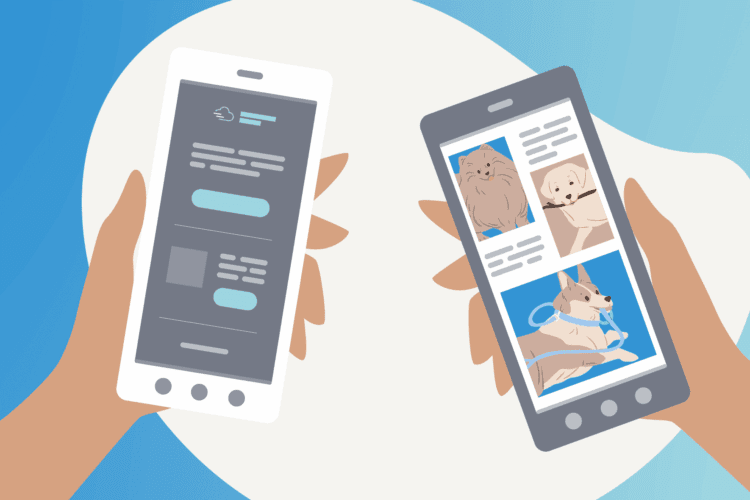
1. Captivate with custom photography
Gone are the days of cookie-cutter stock images. We expect to see more brands using custom photography featuring curated product shots and actual people:
Readers are much more likely to connect with your brand if they can relate to what they’re seeing. Using high-quality, custom images that align with your marketing message is key to driving stronger customer relationships and inspiring meaningful action.
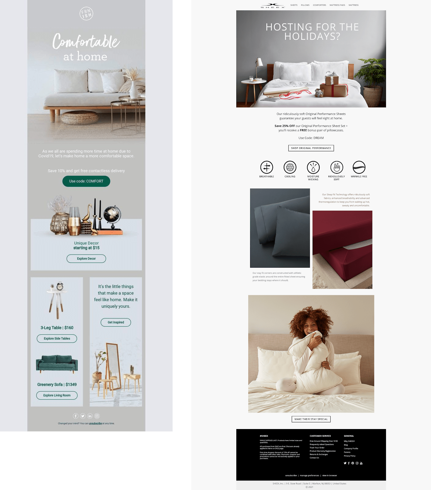
Email design best practices for image placement and layout:
- Use negative space: Place images against a flat color background to draw your reader’s attention to that specific area and make it stand out.
- Break up text with off-center images: Leverage a broken grid layout to help guide readers through longer email content such as newsletters or product features/updates.
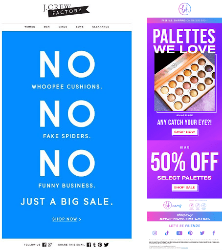
2. Bet on bold typography
There’s no denying that large typography commands attention. Combine it with a powerful, engaging message, and it can be an extremely effective way to acquire those coveted clicks.
Many brands are going so far as to minimize (or completely remove) their email headers and go all-in with an email that only showcases big, bold typography to get their message across in one quick glance.
Email design best practices for incorporating bold typography:
- Choose your words carefully: The words you choose to highlight will undoubtedly be the first (and sometimes only) thing your readers notice, so make sure your message is creative, engaging, and intentional.
- Use bright font colors sparingly: Bold type tends to look overwhelming in glaring colors, so stick to more neutral tones like white or black.
- Keep it clean and concise: Reduce cognitive overload by keeping your email headlines short, sweet, and to the point—two lines or less.
3. Design for Dark Mode
Meant to minimize blue light and help prevent eye strain, Dark Mode is a relatively new accessibility setting that changes your email’s color palette to display it in high contrast using a dark background and a light foreground.
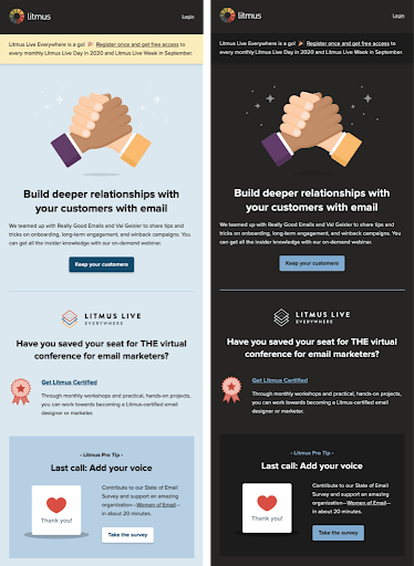
While Dark Mode is quickly gaining traction with consumers, it can be a design stumbling block for a couple of reasons:
- Limits creative potential: Dark Mode alters your colors, so if you want your emails to look good no matter how they’re viewed, you have to be careful with your color selection.
- No control over how ESPs display your email: Outlook, Gmail, and other ESPs all render emails differently in Dark Mode, which means there’s no one way to design.
Email design best practices for Dark Mode capabilities:
- Don’t overlook key assets that need to be optimized for Dark Mode, like logos, background colors, containers, and image elements.
- Switch image formats from JPG to PNG with transparency to limit the number of white-boxed widgets and elements on a dark background.
- Use CTA buttons in colors that contrast against white or dark backgrounds (i.e. orange or light blue).
4. Stand out with subtle animations
With fierce competition in the inbox, animation is a great way to stand out and create a memorable message that resonates with your core audience.
Elements like GIFs, Cinemagraphs, and animated icons surprise and delight audiences, and can demonstrate complex concepts quickly, easily—making them an excellent choice for product-based campaigns.
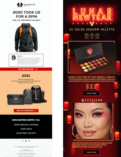
A well-placed animation (like the ones shown above) can be the spark you need to grab your subscribers’ attention, prompt them to keep scrolling, or point them toward a call to action.
Email design best practices for animations:
- Don’t overshadow your message: Creating a polished email with animation can be tricky. There’s a fine line between making it engaging and overdoing it. Be sure to ask yourself whether the motion is enhancing and elevating your message or overshadowing it. Think about the message you want to send and where you can incorporate animations in an impactful way. Try building your animations using a simplified treatment and subtle application to accentuate and complement your messaging rather than using it as a creative focal point.
5. Dive deep with 3D imagery
We’ve recently seen more brands using 3D techniques like photorealism, 3D, and isometric illustration, as well as clever shadow applications, to make their emails look more realistic and visually intriguing.
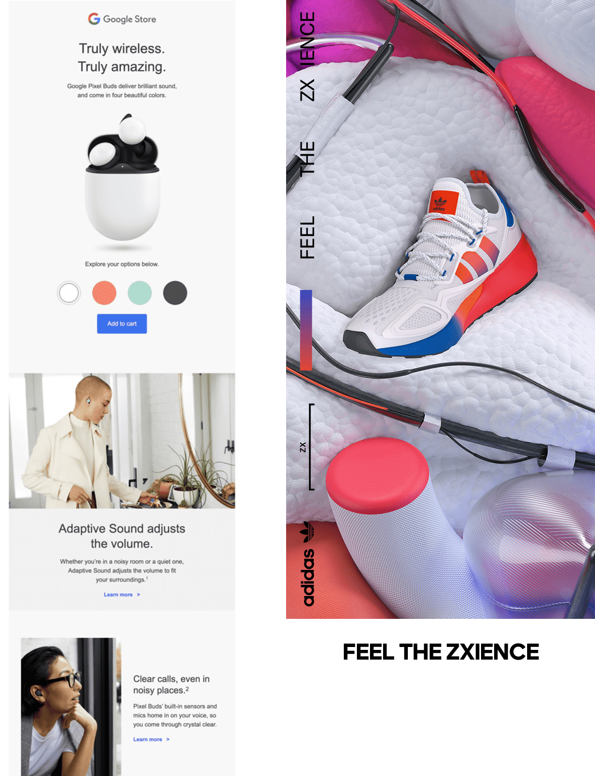
Compared to traditional flat imagery, 3D effects can help bring products or characters to life, make certain elements pop out of the composition, and highlight key messages to drive more clicks with higher intent.
While 3D imagery can be time-consuming to create, it’s an incredibly powerful tool that stands out in customer’s inboxes. Best of all, you can apply it to almost any brand or type of messaging.
Email design best practices for 3D images:
- Choose a subject with depth: If you shoot a product or model against a flat wall, you’re kind of defeating the purpose of 3D photography. For best results, capture a scene that has some elements that are very close, some in the middle ground, and some far away.
- Think outside the box: You can add 3D effects to more than just staged photos, so be sure you don’t limit yourself. Try applying it to text elements or experiment using a scene creator. The opportunities to apply this technique are endless.
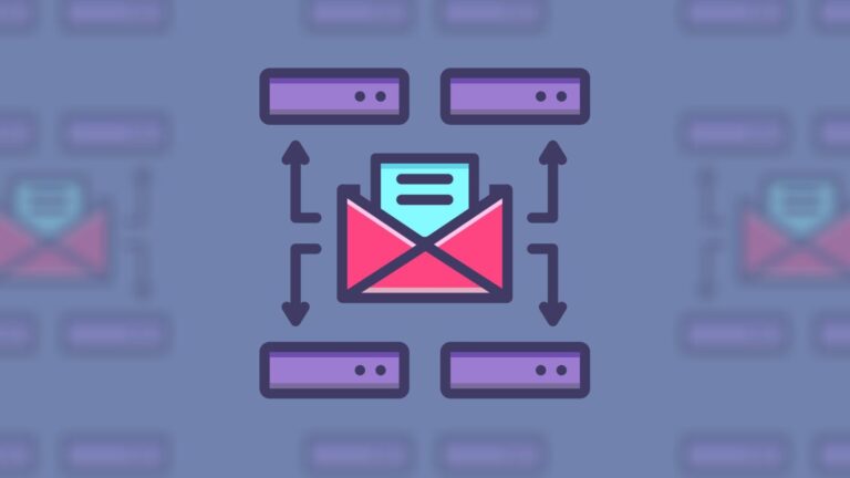
6. Double down on 2D images with textured illustrations
If you’re not ready to start using 3D images just yet, don’t worry: there are still plenty of ways to win big with your 2D images. Adding texture and shading to images and illustrations will give your emails greater depth and dimension.
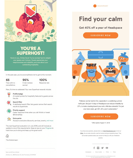
Take a simple image or illustration you’ve already built, and give it an entirely new aspect or emotional appeal by playing with different textures, gradients, tints, color contrasts, and patterns.
Email design best practices for textured illustrations:
- Make some moves: Combining illustrations with GIFs or moving animation goes a long way in making your email design more engaging, driving up the likelihood of conversions.
Want to learn more about the latest in creative? Check out our full free guide to performance creative that gets results.