

In a world where GDPR is finally in the wild and a real concern, tracking users and their data now have more consequences than ever before. There is a simple, yet important solution you can implement to keep your tracking pixels in check and allow for your customers to make informed decisions on what and how they are being “followed.” Simon, a leader in the Digital Intelligence department, released a blog article going over some high-level talking points for GDPR and lightly brushed on Cookiebot. Feel free to take a read first before continuing.
GDPR, Cookie Consent, & You: Examples of User Consent
Even though most of our clients do not cater to EU users, it still behooves us to test and implement a restriction tracking solution for clients who have a segment of their users making purchases from the EU. After some research, we decided to test and implement Cookiebot. It’s straightforward, priced well, and, if you have a tag management platform, easy to implement. But, before we go into implementation, let’s talk about what Cookiebot does so you can understand its awesome power.
In a nutshell, Cookiebot consists of Cookie Consent, Cookie Control, and Cookie Monitoring, with all of its features being managed from the platform with only 2 lines of JavaScript. Hooray!
Cookie Consent & Cookie Control:
You have probably seen something similar to the below message when visiting a new site as of late.
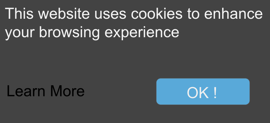
Cookiebot takes this straightforward approach and gives the visitor considerable options for allowing or blocking cookies if the website owner allows it. What this means for a website’s EU visitors is that they can pick and choose what cookie categories they want to allow. How awesome, right? Well, let’s take a look at all of the options available before we say “yes” to that.
Type
The “Type” will dictate the rules for opting in or out for the user.
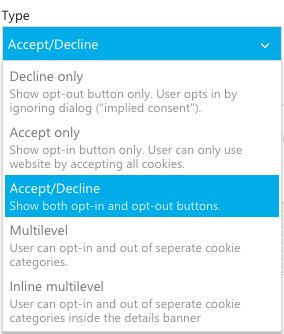
While the Decline Only option seems too lax, the Accept Only option is too restrictive. The Multi options seem nice but could hamper the user experience. From a good-faith, usability standpoint and technical scaling, the Accept/Decline option feels like the happy medium because it gives visitors the power to choose whether to opt in or out.
Method
The method setting is important for us to be as open to restriction as possible without allowing users to “ignore,” then claim it was not readily available for them to opt-out. Our method of choice, “Explicit Consent,” follows users until they choose an option allowing us to block all tracking until they consent. “Applied Consent,” on the other hand, assumes that users consent after the first page if they didn’t click to opt-out, which doesn’t fully satisfy the intent behind GDPR.

Template
The template is more for user experience, BUT, your choice here could have resounding effects on tracking, especially if the pop-up covers certain page elements like the top nav or call to action. Make sure to test the templates on your site before saving, which is easy to do with the “preview” button on the left nav.
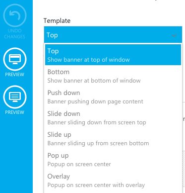
Other Templates can be employed, or, if you are a whiz kid at HTML, CSS, or JavaScript, Cookiebot allows full customization rights in the Template section.
Distribution
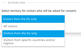
The distribution section is where you can choose a broad segment of website users to have the option of consent. This is also an important section for testing as well, since you can slide back and forth on who is served the consent.
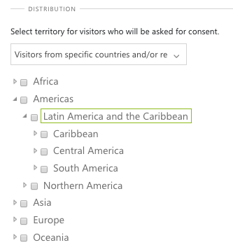
Cookiebot even allows for a deeper segmented pool if that is something needed.
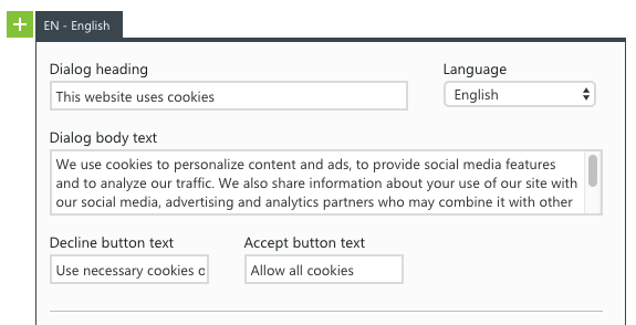
Content
The owner can also customize the wording in the consent, button text, and dialog if users choose to go further into the permission. This is good if you want to use business-specific language, but the default is solid.
Cookie Categorization
One of the features of Cookiebot that we really like, for transparency between the website owner and user perspective, is the Cookie Categorization. The cookies in this section are scanned from the domains provided on the scheduled crawl you set up. What makes this transparent is that categorizing the cookies and giving a description of what they do is easy for the website owner and allows visitors, if they want, to make an informed decision on the data collected while they are on the site. If you are on a monthly crawl cycle, you can manually add a cookie.
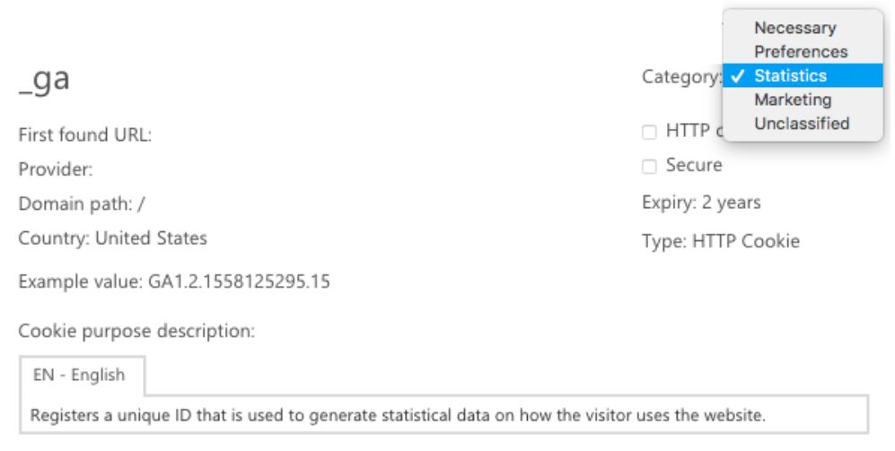
On a side note: Some of the descriptions were blank, so walking through a quick audit would be a good option to keep things as clear as possible.
Cookie Monitoring:
Once a month, Cookiebot will scan your site and generate a declaration for every cookie found. This scheduled scan can be increased to daily by changing your monthly plan.

The cookie report can also show the current state of consent for users and offers the option to change or withdraw consent.
2 Lines Of JavaScript:
That’s right, only 2 lines of JavaScript are needed to get this solution off the ground, sort of.
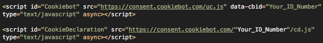
Don’t worry, the above script is available to Copy/Paste in Cookiebot, which also has a handy dandy GTM implementation page. If you read over this (or skimmed it) and your eyes glazed over, give us a holler. We would love to help get you GDPR compliant.
If you are still here, bright-eyed and bushy-tailed, let’s continue.
In reading the implementation docs, you may have noticed some potential issues with Cookiebot’s instructions for your individual site and GTM tracking architecture. This is where all of the good things mentioned above lose some of their luster.
Cookiebot may not be the best solution for your particular scenario if you have the following:
- Multiple Domains: Why? Multiple domains increase the tracking pool and thus responsibility for GDPR. If you are using a subdomain for a specific region, the complexity of compliance may increase as well.
- Medium To Large Site (5,000+ Pages): Why? Medium to large is subjective, but the overall idea is solid. If you have more pages on your website, it is more likely that the team managing those pages is larger. Also, marketing efforts may be segmented to certain pages for specific campaigns, thus increasing compliance issues.
- Multiple GTM Containers On The Same Pages: Why? Yes, Google no longer warns about having two GTM containers on your site. But, if those containers are being managed by different vendors, the overall site compliance may be compromised, and implementing Cookiebot in the other container(s) may not be feasible.
- Multiple Vendors Sharing GTM: Why? Depending on implementation strategy/requirements, there may need to be custom tracking set for other vendors’ marketing pixels/tracking.
- Many Tags That Use Multiple Triggers &/Or Exclusion Rules: Why? More logic, rules, and exceptions increase the likelihood of tracking issues down the road that could affect Cookiebot’s core responsibilities.
Cookiebot can still help your site no matter what. It will just be a larger project to implement than you originally thought, therefore experienced resources must be allocated to get it set up properly. The Digital Intelligence team at Wpromote is all about creative and scalable solutions, so feel free to reach out and see how we can help!
Conclusion?
While Cookiebot is a solid solution, both in pricing and features, it only fully delivers when being implemented by a developer in the right scenario.