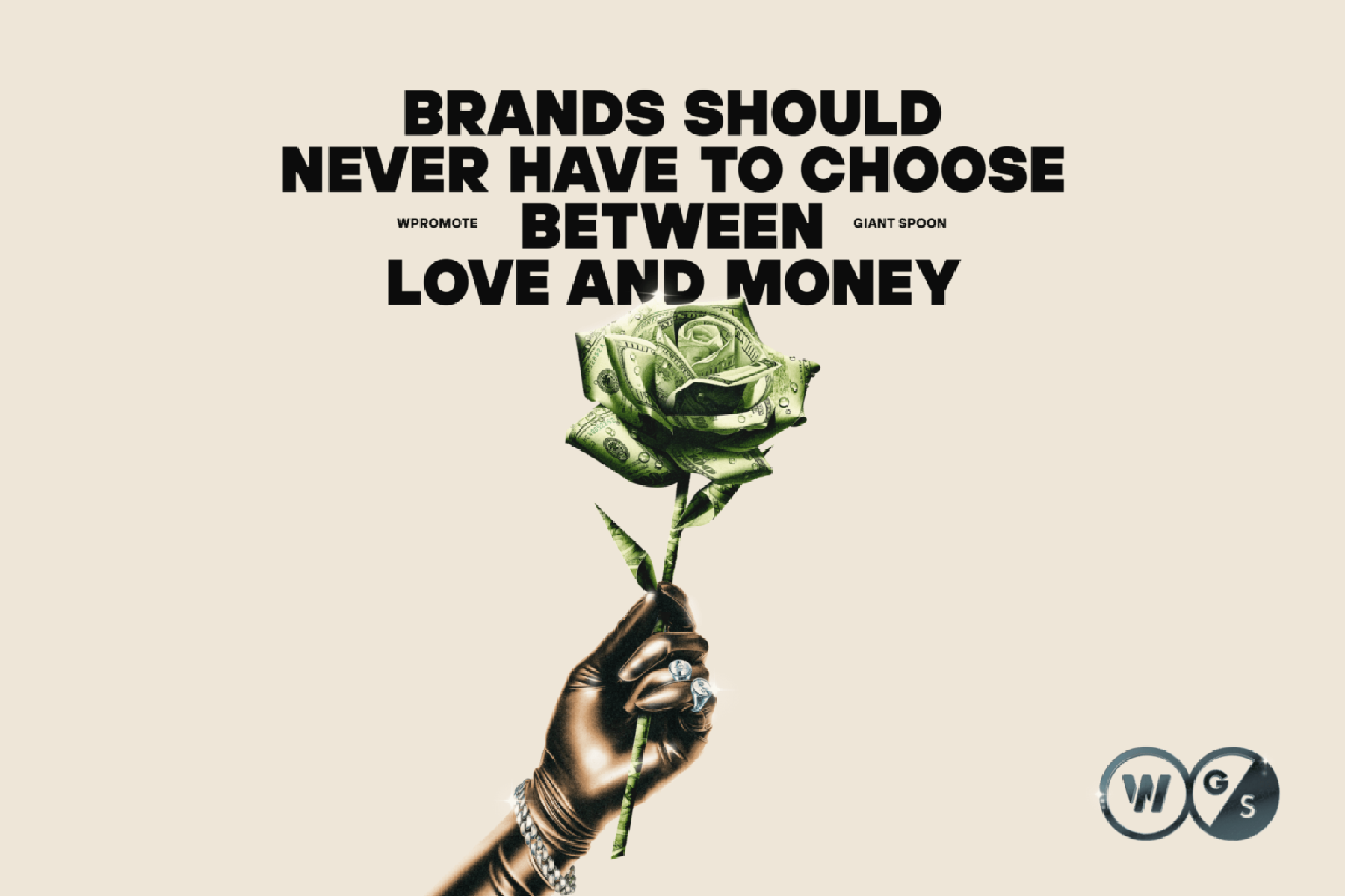
Performance Creative
6 min

The Superiority Of Responsive Web Design

Wpromote

Just the other day a client said to me, “I want to make sure we’re showing up on mobile.” My response: “Yes, yes you do.”

Having a mobile-friendly website has become a vital part of a successful digital marketing campaign in today’s day and age. Despite the fact that Google recently announced that the mobile-first index likely isn’t rolling out until late 2017 or 2018, having a mobile-first mindset now will help set your website apart from competitors and put you ahead of the curve. But before you fully invest your time and resources, it is important to understand that not all mobile-friendly websites are equal. Moreover, the type you use can drastically impact your SEO success.

The Different Types Of Mobile Websites

There are three different types of mobile websites:

  • Responsive Web Design
  • Dynamic Serving
  • Separate URLs

Note that all of these are technically “mobile-friendly,” but responsive web design easily has the most advantages, making it Google’s recommended design pattern. Here is a snapshot from Google’s overview of these different types of mobile-friendly sites:

Configuration options

Responsive Web Design

Websites built with responsive web design have the same URLs and HTML code across desktop and mobile devices. Additionally, responsive web design offers superior user experience and SEO friendliness.

In terms of user experience, responsive websites will display the same content and layout no matter what type of device you’re on (desktop, mobile, tablet, etc.). The only difference is that the site will be sized to fit the devices’ various screen sizes. This allows you to easily make changes to content, images, videos, etc. on your master site that will appear the same across all representations of your site.

In terms of SEO friendliness, because the site’s HTML code remains the same on every device, Google can crawl the mobile version of your website and see all content, and thereby index the site as a mobile search result that can be displayed to mobile users. This allows all the content on your mobile site to be crawlable by Google, which is essential for Google’s upcoming mobile-first index.

Example Of Responsive Web Design Website

Example Of Responsive Web Design Website

As noted, all the website content from the desktop site can be found on the mobile site; the way it is displayed just adapts to the screen size. On the mobile version, the full navigation menu is hidden in the hamburger menu in the upper-right corner for better usability, but all the site’s content is still available.

Dynamic Serving

Dynamic serving websites have the same page URLs for the desktop and mobile versions of the site, but different HTML codes.

Dynamic serving sites are usually used for very large sites where it’s difficult to showcase all content through responsive web design on different devices. The benefit of using dynamic serving design is that it makes for a great mobile experience for users (assuming proper implementation is utilized). However, dynamic serving websites lose some SEO strength due to the fact that the HTML code is different for the desktop and mobile versions of the site.

Nevertheless, if a company is willing to update the desktop and mobile HTML codes to be SEO-friendly then dynamic serving websites can work out well. Though, keep in mind that the cost to implement and maintain dynamic serving sites is usually higher than what most small- to medium-sized businesses want to spend on a website. Even online product giants like Amazon and Target have switched from dynamic serving websites to responsive design, following Google’s preferred trend.

Example Of Dynamic Serving Website

Example Of Dynamic Serving Website

As illustrated, the content on the mobile site is dramatically different from the content on the desktop site. In fact, there is minimal text on the mobile site, and it only showcases a few calls to action with the hamburger menu housing the links to other pages. Once Google rolls out their mobile-first index, this site will likely decrease in the search engine rankings because of its lack of text. That being said, some dynamic serving websites can include text content and some may even look very similar to responsive websites—it’s all a matter of steadfast implementation of the mobile HTML versus the desktop HTML. Though, as you can imagine, it can become tedious to maintain two sets of HTML coding.

Separate URLs

Separate URLs sites have different URLs and different HTML code. The URLs are usually formatted as “mobile.domain.com,” “m.domain.com,” or some other variation on mobile devices.

Prior to the rise of responsive web design, and during the age of glacial mobile internet speeds, separate URLs was seen as the best design pattern for mobile-friendly sites. This design pattern only highlights a few key pages or buttons. Now that Google is switching to a mobile-first index because 60% of Google searches are coming from mobile devices, separate URLs have lost their appeal. Because of their lack of content, sites with separate URLs struggle to compete in a mobile-first index. Also working against the separate URLs design pattern is the likelihood of losing valuable mobile traffic with a separate URL for the mobile and desktop websites.

Example Of Separate URLs Website(s)

Example Of Separate URLs Website(s)

The separate URLs mobile site looks similar to the previous example featuring the Wells Fargo dynamic serving website. As with dynamic serving websites, it’s possible to have the mobile version of a separate URLs website have more text content and link to all content on the site. That being said, as with dynamic serving websites, it becomes incredibly tedious and difficult to maintain because the code for the mobile site and desktop site both need to be changed. As the mobile-first reality kicks in, this example orthodontics site will likely see a decrease in search traffic due to a decrease in its search engine rankings.

Responsive Web Design: A Cut Above The Rest

Having a mobile-friendly site has a huge impact on SEO. However, as demonstrated, not all mobile-friendly websites are equal. Due to its strength in user experience, SEO friendliness, and superiority over dynamic serving and separate URLs websites, responsive web design is Google’s go-to form of web design. As we live in the midst of an ever-evolving, mobile-first universe, I recommend using responsive web design to set up your website for best success.

Creative Services

Responses

Write a response…

Related Posts
Prev
Next

Think Like A Challenger

Subscribe to keep up to date on the latest innovations in digital marketing and strategies our Challenger Brands leverage for success.

All